Choice Overload: Why Giving Customers Too Many Options Can Reduce Sales
8–10 min read — Digital Marketing
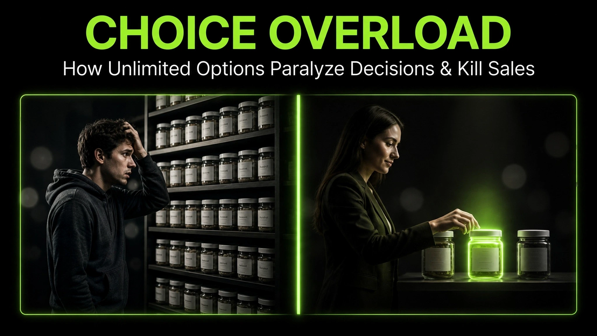
Imagine walking into a store with 200 types of jam. Every jar looks interesting. Every label promises something slightly different. You stand there, pick up one, put it back, pick up another, and eventually walk out empty-handed.
Now imagine a store with 6 types of jam. You taste two, choose one, and leave happy.
This is the paradox of choice: the more options we are given, the less likely we are to choose any of them.
For businesses, this is not just a curiosity. It is a silent sales killer.
What Is Choice Overload?
Choice overload is what happens when too many options make a decision harder instead of easier. The mind wants variety, but it also wants clarity. When variety overwhelms clarity, the brain stops choosing and starts avoiding.
This is not laziness. It is a protective response. Every option has to be evaluated. Every choice carries the risk of regret. The brain, facing too many paths, chooses the safest one: no path at all.
Key idea
Choice overload does not happen because people are indecisive. It happens because decisions have a cost. The more options there are, the higher that cost becomes.
Every additional choice adds a small mental tax. Each one must be compared, weighed, imagined in the buyer’s life. At some point, the tax becomes more painful than the reward. That is when the buyer walks away.
Too much choice does not feel like freedom. It feels like work.
Choice is not the same as clarity. A crowded menu is not more generous. It is just harder to read.
The best product experiences are not the ones with the most options. They are the ones where the right option is easiest to see.
Why the Brain Shuts Down When Options Pile Up
Three things happen when the brain faces too many choices at once:
1. Comparison fatigue. Comparing 40 options uses far more mental energy than comparing 4. The brain runs out of patience long before it runs out of options.
2. Anticipated regret. More options mean more chances to choose wrong. The fear of picking the wrong one becomes stronger than the desire to pick any one.
3. Decision avoidance. When the cost of deciding feels higher than the value of the reward, the brain simply delays—or leaves.
This is why unlimited choice rarely feels like a gift. It often feels like a burden.
The 4 Ways Choice Overload Shows Up
Choice overload is not limited to product shelves. It appears everywhere a decision is made.
1. Product pages. Thirty similar SKUs with minor differences. The buyer cannot tell which one is right for them.
2. Pricing pages. Five plans, each with overlapping features. The visitor does not know which tier fits.
3. Menus and navigation. Ten top-level categories with twenty sub-options. The user has to search for the path forward.
4. Email and content. Newsletters offering ten topics at once. The subscriber engages with none.
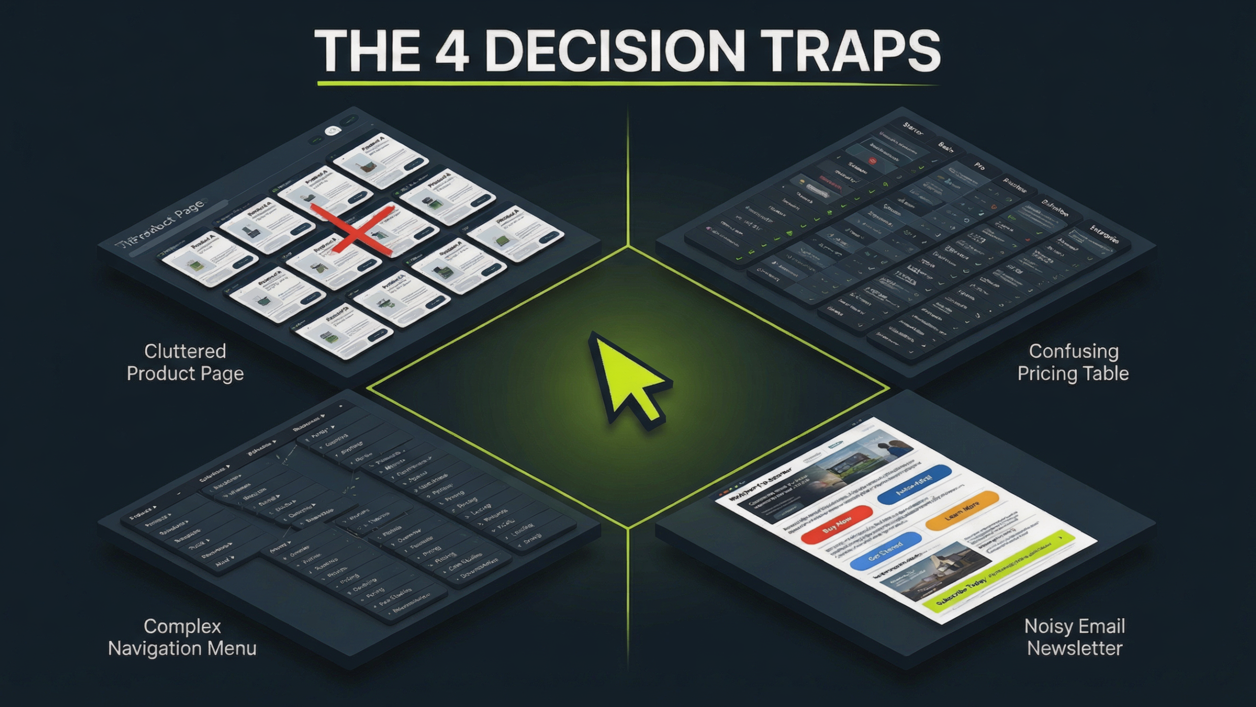
In each case, the problem is not that the options are bad. It is that the differences feel unclear. When options blur into each other, the brain cannot choose between them—and choosing nothing becomes easier than choosing wrong.
Why "Fewer, Better Options" Often Sells More
Reducing options does not reduce value. It increases clarity. And clarity increases action.
When a page shows three carefully chosen options instead of thirty, three things happen:
1. Decision time drops. The brain compares fewer variables and reaches a conclusion faster.
2. Confidence rises. Fewer options mean less risk of choosing wrong.
3. Satisfaction grows. Buyers are happier with their choice because they do not feel they missed a “better” option they never saw.
Fewer options, chosen well, feel like curation. Many options, thrown together, feel like noise.
Curation is not restriction. It is a service.
The brand does the hard work of filtering so the buyer does not have to.
The Role of Defaults and Recommendations
When choices are overwhelming, people look for a shortcut. They look for what others chose, what the brand recommends, or what feels like the default option.
This is why “Most Popular” tags work. Why “Recommended for you” influences decisions. Why pricing pages highlight one plan as the best fit.
These signals are not manipulation. They are relief. They give the buyer a way to choose without having to solve the whole puzzle themselves.
When the buyer cannot decide, the brand must decide for them—clearly and honestly.
A recommendation is not a command. It is a hand extended to someone who is stuck.
The Ethical Line: Simplifying vs. Hiding
Reducing options is a form of curation. But it can also become a way to hide things.
Hiding a cheaper plan. Omitting a more suitable option. Making one path look easier to push the buyer toward a more profitable choice. These are not simplifications. They are manipulations.
The difference is simple: honest curation helps the buyer choose well. Dishonest curation helps the brand sell more. Both can look similar on the surface. But one respects the buyer, and one uses them.
The TarkWorld Principle of Honest Simplicity
Reduce options to make the choice clearer—not to make the preferred option unavoidable. Simplifying should help the customer decide, not decide for them.
A good menu is not shorter because the chef is hiding dishes. It is shorter because the chef knows which ones matter.
How to Reduce Choice Overload Without Losing Sales
Reducing options is not about offering less value. It is about offering less friction. Here is how to do it well.
1. Cut overlapping options. If two products serve the same customer, merge them.
2. Group by intent, not by feature. Organize around what the buyer wants to do, not what the product can do.
3. Highlight a recommended option. Most buyers want guidance, not endless comparison.
4. Use clear labels. “Best for beginners” beats “Standard Tier 2.”
5. Offer a custom path only when needed. Some buyers want depth—but most want a decision.
Simplicity is not the absence of options. It is the presence of a clear path.
When the buyer knows where to look, they act faster. And when they act faster, they often buy more—not less.
A Tale of Two Menus
Two menus. Same restaurant. Same kitchen. Same prices. Different number of options. Different outcomes.
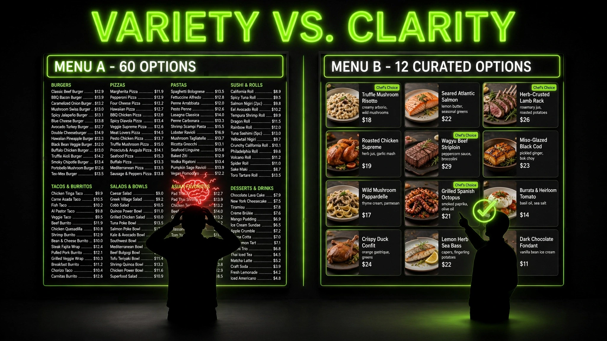
Below is a simple side-by-side. Neither is a rule. They show two ways the same choice can be presented.
Menu A
Sixty dishes across twelve categories. Every dish has a similar description. The guest reads, rereads, and finally orders the same thing they always order—or asks the waiter to decide.
Menu B
Twelve dishes, clearly grouped. Each one described with a distinct reason to choose it. The guest reads once, picks with confidence, and often orders a second item because the decision felt easy.
HUMAN INSIGHT
People do not want endless options. They want the feeling that they had a real choice—without the burden of proving it.
A short menu of well-chosen options feels generous. A long menu of similar options feels exhausting. The difference is not the number. It is the meaning behind each option.
This is why the best product pages do not show everything. They show the right things, arranged so the decision feels obvious.
HUMAN INSIGHT
The brain is not designed to compare 50 options at once. It is designed to make quick, safe decisions and move on. When a page fights that instinct, the buyer disengages.
Simplify to match the brain’s pace—and the buyer feels relief, not restriction.
A good choice feels like a shortcut. A bad choice feels like a test.
The Bigger Lesson: Clarity Sells More Than Variety
Variety is tempting because it feels like generosity. But generosity without clarity is just confusion in a nicer package.
The brands that sell best often offer fewer options, arranged better. Not because they have less to offer, but because they understand that the customer’s job is not to explore—it is to decide.
When you help someone decide, you are not limiting them. You are respecting them.
That respect is what turns a browsing visitor into a returning customer.
A Final Thought for Founders and Marketers
Every additional option is a small tax on the buyer’s attention. Every simplified choice is a small gift.
The businesses that grow are not the ones that offer the most. They are the ones that make the decision easiest. They respect the buyer’s time, energy, and hesitation—and they design around it.
When you reduce choice intelligently, you do not reduce sales. You remove the obstacles that were quietly blocking them.
That is the version of simplicity that sells.
Frequently Asked Questions
What is choice overload?
Choice overload happens when too many options make a decision harder instead of easier. The buyer becomes hesitant, overwhelmed, or unable to decide—and often ends up choosing nothing at all.
Why do too many options reduce sales?
Because more options increase the mental cost of deciding. The brain has to compare more, imagine more, and risk more regret. At some point, avoiding the decision becomes easier than making it.
How many options should a business offer?
There is no universal number. What matters is whether each option has a clear reason to exist. If two options serve the same customer, merge them. Fewer, well-chosen options usually sell better than many similar ones.
Does simplifying a menu or catalogue hurt revenue?
Usually not. In most cases, simplifying improves conversion because it reduces friction. Some customers may miss a niche option, but the gain in clarity and decision speed often outweighs the loss.
Is offering fewer options always better?
No. Some audiences genuinely want depth and choice. The goal is not to offer the fewest options—it is to offer options that feel distinct, relevant, and easy to compare. Clarity, not scarcity, is the rule.
Simplify the choice. Respect the buyer.
Good digital communication is not about adding more information. It is about making the important information easier to notice, understand and evaluate.