From Attention to Action: Understanding the Psychology of an Online Customer
8–10 min read ·— Digital Marketing
Every purchase online begins long before the checkout page. It begins with a small moment of attention—a headline, an image, a recommendation from a friend.
From there, a quiet process unfolds. The visitor scrolls, reads, compares, doubts, and finally decides. That decision rarely happens in a single step. It happens across a sequence of small psychological shifts.
Understanding that sequence is one of the most useful skills a marketer can develop. Not to push people faster, but to meet them where they are—and help them move forward honestly.
What Is the Online Customer Journey?
The online customer journey is the series of mental stages a person moves through before buying. It is not a funnel on a slide. It is a psychological sequence, and each stage needs something different from the brand.
Most businesses treat every visitor the same—as if they were all ready to buy. But at any given moment, a visitor might be curious, cautious, comparing, doubting, or simply killing time. The message that works for one of those states will fail for the others.
Understanding the journey means understanding what each visitor actually needs at each moment—and meeting them there.
Key idea
People do not move from attention to action in one step. They move through small psychological gates.
Each gate has a question. And only when the question is answered does the visitor feel safe enough to move to the next one.
What is this? Is it for me? Can I trust it? Is it worth the price? Will I regret this? The job of a brand is not to push past these questions. It is to answer them—clearly, honestly, and in the right order.
The sale is not a push. It is the natural result of every question being answered in order.
When the buyer never feels rushed, they move faster.
The 5 Stages From Attention to Action
Every online buyer passes through five psychological stages:
1. Attention. They notice something. Their eyes stop moving. This lasts a fraction of a second.
2. Interest. They read a little more. The message feels relevant. Curiosity grows.
3. Desire. They imagine the outcome. They see how the product could fit into their life.
4. Trust. They look for reasons to believe. Reviews, details, guarantees, familiarity.
5. Action. They make the decision. The purchase feels like the natural next step.
Understanding each stage is not about speeding the visitor up. It is about making sure nothing feels missing at the moment they need it most.
What Happens in the Mind at Each Stage
At each stage, the visitor is asking a different question. And each question needs a different answer.
Attention: “Is this worth noticing?” Answer: a clear, relevant first impression.
Interest: “Is this about me?” Answer: specific language that speaks to a real situation.
Desire: “Could this actually help me?” Answer: a visible outcome, a story, or a demonstration.
Trust: “Is this real?” Answer: reviews, details, evidence, and honest pricing.
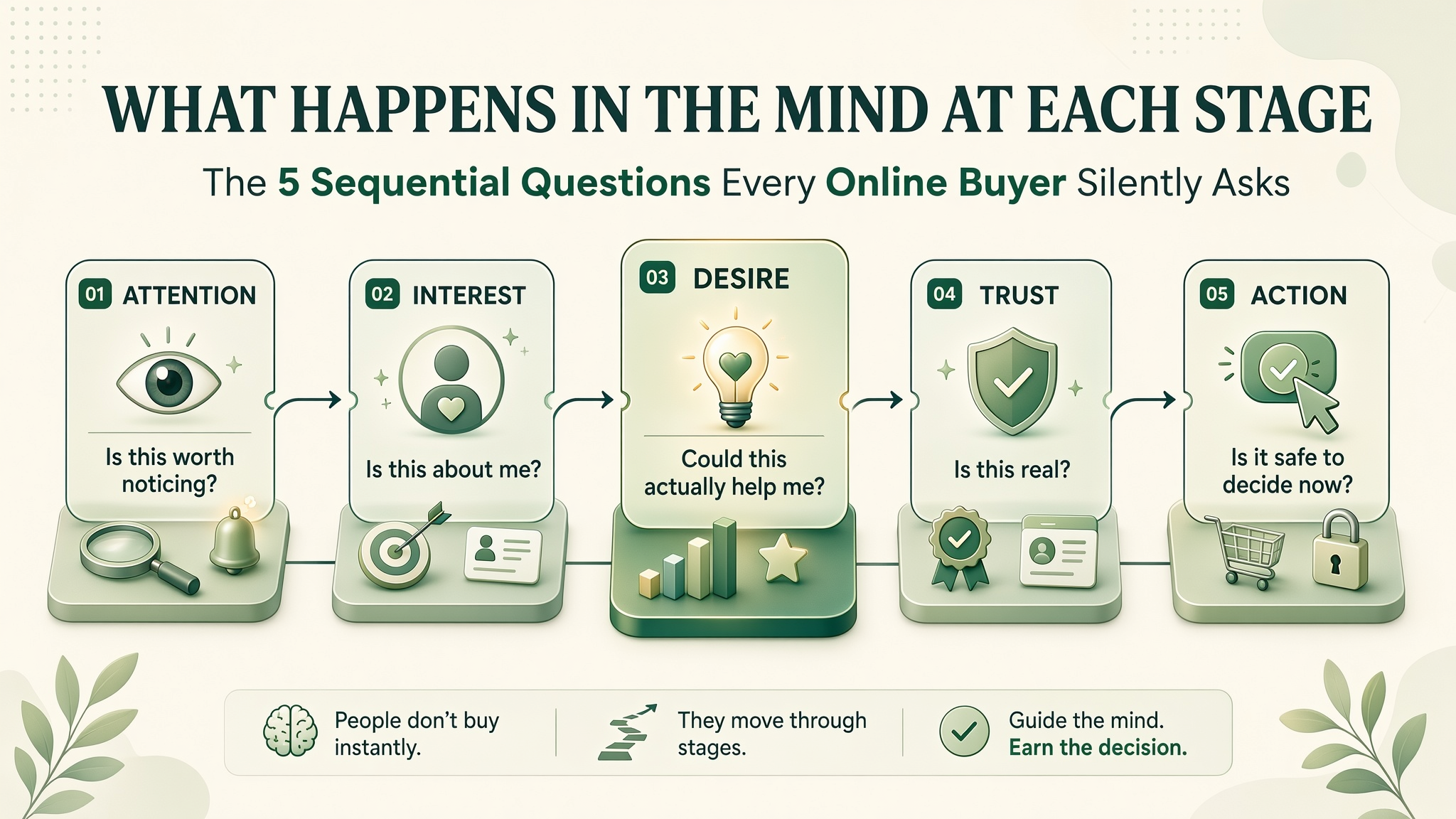
Action: “Is it safe to decide now?” Answer: a clear path forward, honest terms, and no last-minute surprises.
When these questions are answered in the right order, the buyer moves forward calmly. When they are skipped or rushed, the visitor quietly backs out—often without even realizing why.
Why Attention Alone Never Converts
Attention is the door. It is not the decision. Many brands focus all their energy on grabbing attention—bigger headlines, louder images, clever hooks—but give the visitor nothing once they arrive.
The result is high bounce rates. The visitor stops, looks, and leaves. Not because the content was bad, but because nothing happened after the first moment. The curiosity was triggered and then dropped.
Attention is the beginning of a sequence, not the end of one. If the brand has no plan for what happens after the first second, the first second was wasted.
Attention is borrowed. Trust is what keeps it.
Without trust, no amount of attention turns into action.
The Role of Emotion and Evidence
Customers move forward on two wheels: emotion and evidence. Emotion makes them want it. Evidence makes them feel safe buying it. Take away one, and the journey stalls.
Emotion without evidence feels like hype. Evidence without emotion feels like homework. Neither carries a buyer all the way to action on its own.
The best pages alternate between the two. A story, then a detail. A feeling, then a proof. A wish, then a reassurance. That rhythm keeps the visitor moving—not because they are pushed, but because each step feels supported.
Emotion makes the buyer want it. Evidence makes the buyer feel safe buying it.
The best content carries both, in the right order, at every stage.
The Ethical Line: Guiding vs. Pushing
Understanding the customer journey can be used to guide people—or to push them. The difference is not subtle.
Guiding means answering the visitor’s real question at the moment they have it. Pushing means skipping ahead to force a decision the visitor is not ready to make. Guiding respects the sequence. Pushing breaks it.
When a buyer is pushed, they may still purchase. But they rarely return. The memory of the pressure lingers longer than the memory of the product. Guiding leaves a different memory: the feeling of being understood.
The TarkWorld Principle of Honest Guidance
Meet the visitor where they are, not where you want them to be. Answer the question they are actually asking at this moment. Do not rush them past a stage they are not ready to leave.
Guided buyers come back. Pushed buyers rarely do.
How to Design for Each Stage
If you want to support the journey rather than fight it, these principles help.
1. Start with relevance. The first line should tell the visitor what this is and why it might matter to them.
2. Move to interest. Use specific language that speaks to the visitor’s real situation.
3. Build desire slowly. Show what changes for someone like them. Stories and specific outcomes.
4. Confirm with evidence. Reviews, numbers, guarantees, transparent details.
5. Make action feel safe. Clear pricing, simple checkout, no surprises, easy exit if they change their mind.
6. Do not skip a stage. If the visitor is still at “interest,” they do not need more urgency—they need more clarity.
Each stage is a small door. The visitor walks through at their own pace. Your job is to make sure the next room is ready.
A Tale of Two Pages
Two product pages. Same product. Same price. Same audience. Different journey design. Very different outcomes.
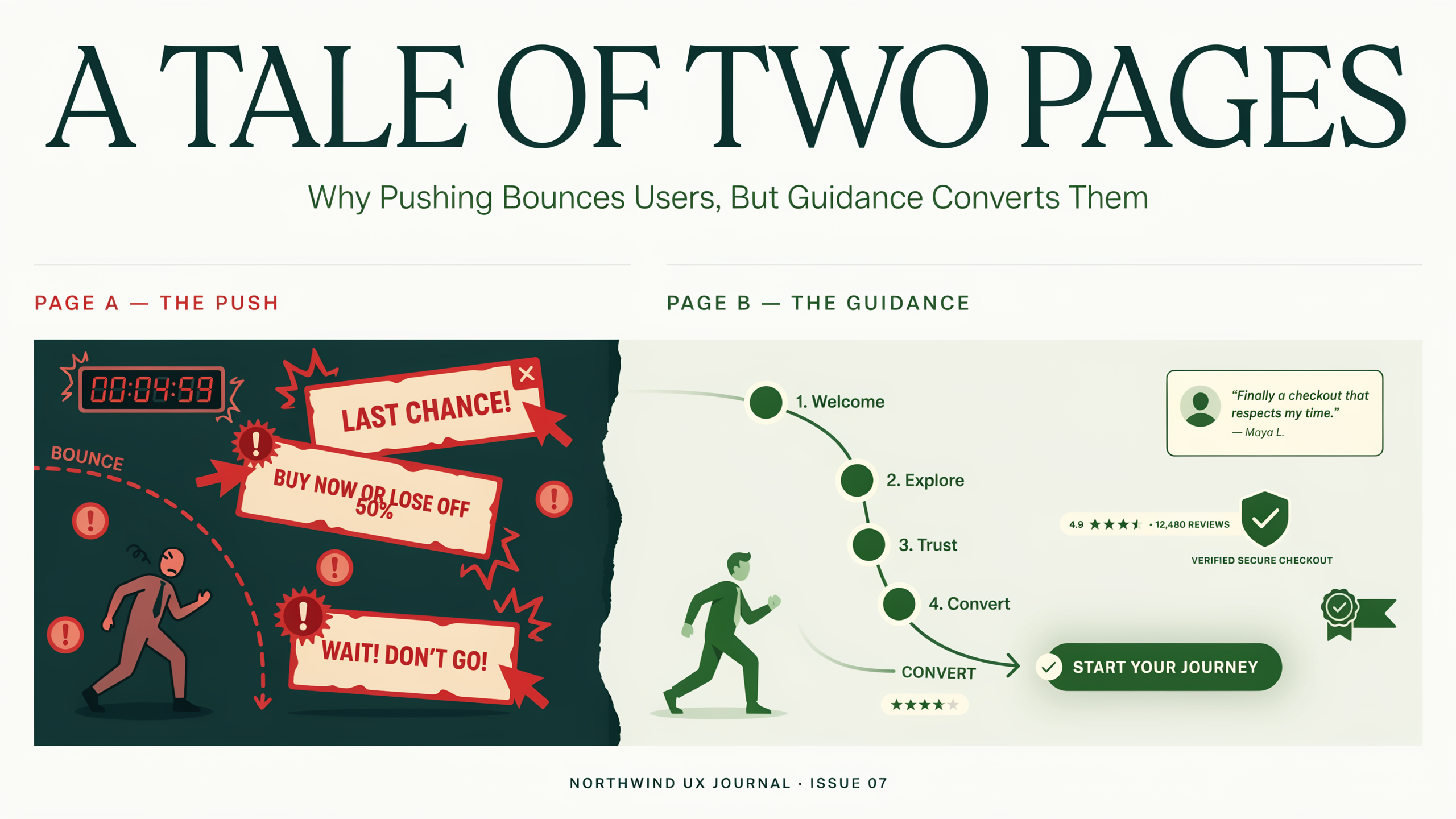
Below is a simple side-by-side. Neither is a rule. They show two ways the same product can be presented to a visitor who just arrived.
Page A
Opens with a discount countdown, five buttons, and a long features list. Skips past “interest” and “trust” to push the visitor toward “action.” The reader feels rushed. They leave without understanding what the product even is.
Page B
Begins with a clear promise. Then shows a real example of who uses it. Then presents real reviews with names. Then explains the price honestly. Finally, offers one obvious next step. The reader moves forward calmly—because each stage answered the question they were already asking.
HUMAN BEHAVIOR INSIGHT
People rarely move from curiosity to purchase in one clear step. They move slowly, answering their own questions along the way. Every stage has a job. When a stage is skipped, the buyer quietly pulls back.
Understanding this changes how brands write, design, and sequence their pages. It is not about making the buyer move faster. It is about making sure nothing is missing when they are ready to move at all.
This is why the best marketing does not feel like marketing. It feels like understanding—one stage at a time.
HUMAN BEHAVIOR INSIGHT
Every buying decision is really a series of small decisions. Each one is a yes or a no. A brand that answers the right question at the right moment earns more yesses—not because it pushed, but because it kept up.
That rhythm is what turns a browsing visitor into a buyer. Not the campaign. Not the countdown clock. Just the quiet act of understanding where the customer is—and being there.
A buyer does not need to be convinced. They need to feel understood.
The Bigger Lesson: Follow the Journey, Not the Funnel
A funnel is a diagram. A journey is a person. The diagram shows where people go. The journey shows how they feel. Only one of those actually changes behavior.
When brands design for the journey, they stop trying to force visitors into stages they are not ready for. Instead, they follow the customer—answering each question as it comes, offering each proof at the moment it is needed, and letting the decision form naturally.
That is slower in theory. But in practice, it moves people forward faster—because nothing is fighting their natural pace.
The best marketing does not move faster than the customer. It moves with them.
A Final Thought for Marketers and Founders
The next time you design a page, do not ask, “How do I get them to buy?” Ask, “Where is this person on the journey right now—and what do they need from me at this moment?”
The answer is usually simpler than a campaign. One clear promise. One honest proof. One obvious next step. That is often enough to move a visitor from attention to action.
Not because they were pushed. Because they were understood.
That is the version of marketing that lasts.
Frequently Asked Questions
What are the stages of the online customer journey?
Attention, interest, desire, trust, and action. Each stage has a question the visitor is silently asking. When the brand answers that question at the right moment, the visitor moves forward. When the question is skipped, the visitor pulls back.
Why do visitors leave even when they are interested?
Usually because a question went unanswered. They wanted proof and got hype. They wanted clarity and got pressure. They wanted a next step and found confusion. Interest alone does not carry a buyer to action—every stage has to be supported in the right order.
Is emotion or evidence more important?
Both are necessary. Emotion makes the customer want the outcome. Evidence makes them feel safe to act on that desire. Emotion without evidence feels like hype. Evidence without emotion feels like homework. The best pages use both—alternating them at the right moments.
How do I know which stage my visitor is in?
Look at where they arrived from and what they clicked. A blog post usually brings in people at the “aware” or “interest” stage. A comparison page attracts people at “desire” and “trust.” A pricing page catches people at “action.” Match the page to the stage the visitor is most likely in.
Can small brands design for the full journey?
Yes—and often better than large brands, because small teams can write more specifically for their audience. A single page that answers each stage honestly, in order, can outperform a complex funnel. It is not about the size of the machine. It is about the clarity of each step.
Guide the journey. Earn the action.
Good digital communication is not about adding more information. It is about making the important information easier to notice, understand and evaluate.