The Psychology of First Impressions: How Your Website Is Judged in Seconds
8–10 min read – · Digital Marketing
You click a link. A page opens. Before you read the first paragraph, your brain has already started working.
You notice the spacing. The colors. The images. Whether the page feels calm or chaotic. Whether you understand where you are. Whether the brand looks familiar. Whether you feel comfortable continuing.
This happens incredibly quickly because the brain is constantly trying to reduce uncertainty. A website is not just a collection of pixels. To a visitor, it is an environment that must be understood before it can be trusted.

What Is a First Impression in Digital Marketing?
A first impression is not a final judgment. It is an early mental shortcut that helps a visitor decide whether to keep paying attention, explore further, or leave.
Good design does not force trust. It makes understanding easier.
Key idea
Humans make rapid judgments because attention is limited. When a new environment appears, the brain looks for familiar patterns and obvious signals: What is this? Is it relevant? Can I understand it? Does anything feel risky?
That means the first impression of a website is created by many things at once—not only by the headline or the logo.
The visitor is processing the whole environment before consciously analyzing individual parts.
When everything competes for attention, nothing feels important.
A strong visual hierarchy gives the brain an easier path. One clear headline. A useful supporting message. A visible next step. Enough whitespace to separate ideas.
Clarity reduces mental effort. It lets the visitor spend energy understanding the offer instead of figuring out how the page works.
Why Your Brain Judges a Website So Quickly
People are more comfortable with patterns they recognize. Familiar navigation, familiar content structures and consistent brand cues reduce the amount of learning required.
This does not mean every website should look identical. It means useful conventions should not be abandoned just to appear different.
A visitor should be able to recognize what is clickable, where information lives, and how to move forward without having to solve a design puzzle.
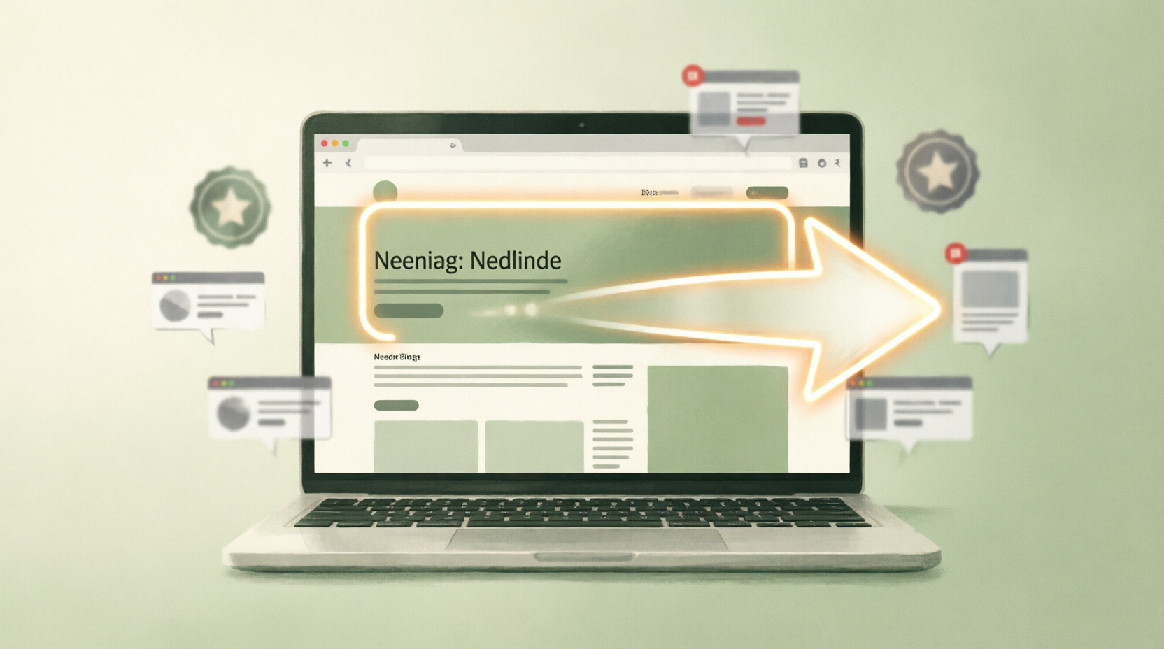
Your headline is often the first meaningful piece of information a visitor processes.
A strong headline answers a basic question quickly: What is this, and why might it matter to me?
When a headline is clever but unclear, the visitor has to work harder. When it is specific and relevant, the rest of the page has a better chance of being understood.
Visual Clarity: When Less Work Feels More Trustworthy
Trust is rarely created by one giant element. It is built from small signals that agree with one another.
Clear contact information. Realistic claims. Consistent branding. Authentic reviews. Understandable pricing. Useful explanations. A page that behaves as expected.
Each signal answers a tiny uncertainty. Together, they shape the overall feeling of the experience.
A polished interface can still feel untrustworthy if the promise and the experience do not match.
Maybe the design looks premium but the copy is vague. Maybe the brand claims expertise but provides no useful evidence. Maybe the page uses urgency everywhere even when nothing is actually urgent.
People may not consciously name the problem. They simply experience friction or doubt.
First impressions teach marketers an important lesson: attention is not created by decoration alone.
A page earns attention when the visitor can quickly understand the situation, see relevance and feel enough confidence to continue.
That means good marketing and good design are closely connected. Both reduce unnecessary confusion.
Familiarity and Pattern Recognition
Psychology becomes dangerous when presentation is used to hide reality.
There is a difference between making information easier to understand and making a weak offer look stronger than it is.
Dark patterns, fake urgency, misleading testimonials and hidden information may influence behavior, but they do not create genuine trust.
Make the truth easier to see.
That is the simplest principle behind respectful digital design. If the product is useful, the website should help people understand its value. If there are limitations, the website should not bury them.
The goal is not to control the visitor’s decision. The goal is to give the visitor a clear enough environment to make an informed one.
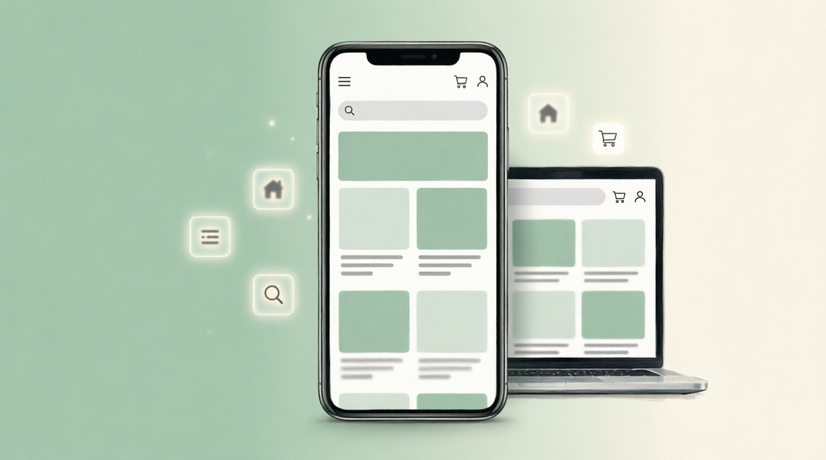
How to turn first-impression psychology into practical website decisions.
1. Lead with clarity. Tell visitors what the page is about.
2. Reduce visual competition. Give the most important message the strongest visual position.
3. Use familiar patterns. Navigation should feel intuitive.
4. Show evidence. Use genuine reviews, examples, demonstrations or case studies.
5. Match promise with experience. The page should feel like the product it represents.
The Headline Is a Direction Sign
Imagine two businesses selling the same service.
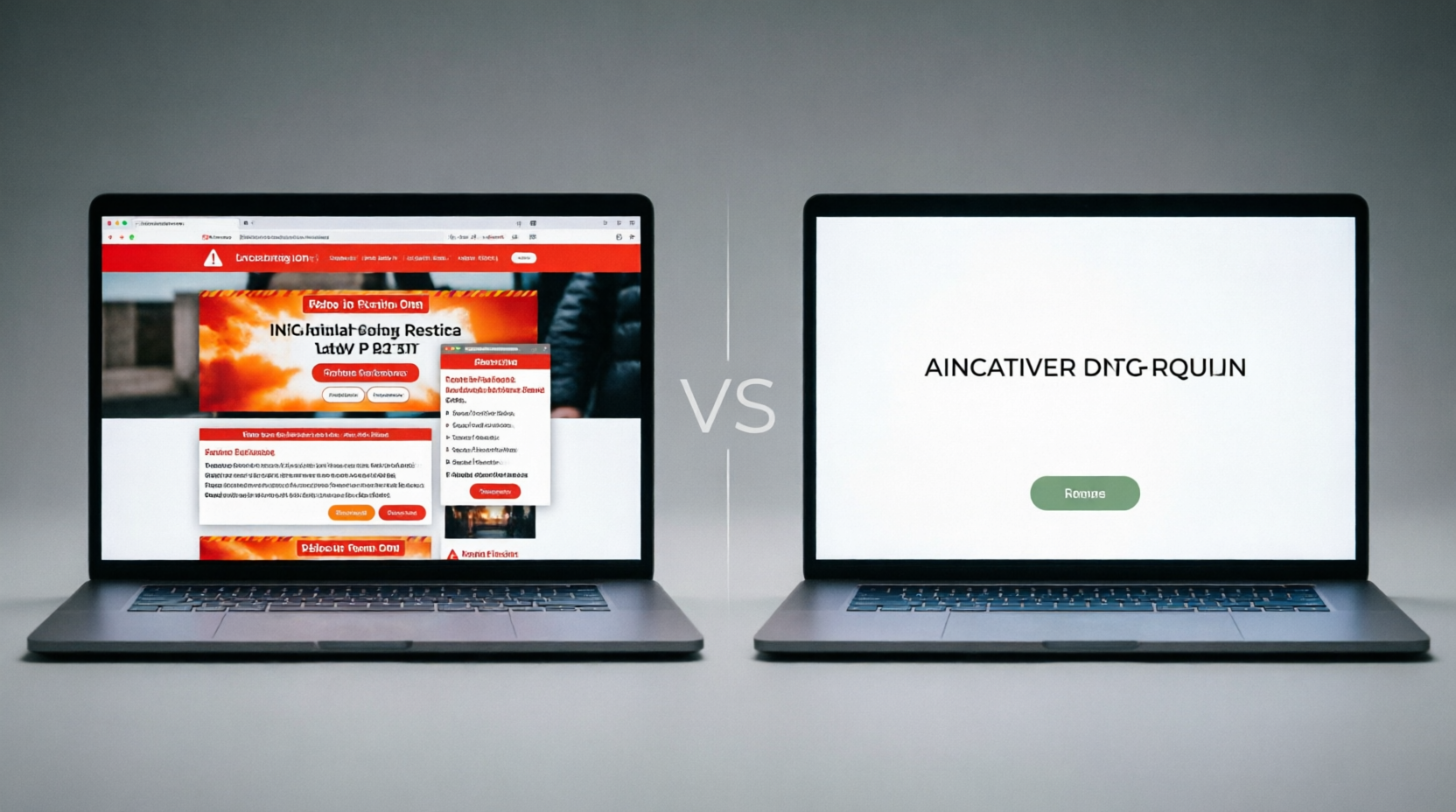
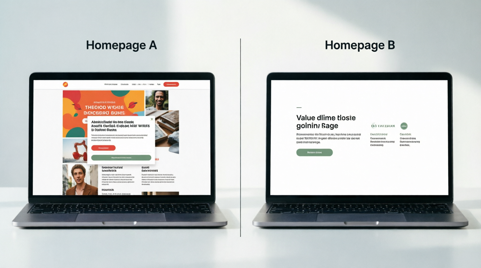
One homepage is packed with badges, flashing offers, huge claims and multiple competing buttons. The other opens with a clear statement of who the service helps, what it does and what the visitor can explore next.
The second page is not necessarily more valuable. But it creates less work for the visitor.
That difference matters because first impressions are partly about how much mental effort the page demands.
Homepage A
Large promotional claims. Five competing calls to action. Dense sections. Stock imagery. Unclear pricing. Several pop-ups before the visitor can understand the offer.
Homepage B
One clear promise. One useful supporting explanation. A recognizable navigation pattern. Evidence placed near the claim. A visible next step and enough whitespace to breathe.
The Trust Signals Hidden in Small Details
Open your own website and give yourself only ten seconds.
Then ask:
What do I think this brand does?
Who do I think it is for?
What do I think I should do next?
What feels confusing?
What makes me trust it?
If you cannot answer those questions quickly, the visitor may struggle too.
The core question hiding behind every website visit
Visitors are not only reading your words. They are continuously deciding whether the environment deserves more attention.
When Design Looks Good but Still Feels Wrong
People do not experience a website as separate design elements. They experience it as one overall feeling of clarity, effort, relevance and safety.
First impressions are built from the combined effect of many small signals.
When we zoom out, the lesson becomes simple.
A website is a conversation before it is a conversion machine. The visitor arrives with limited attention and incomplete information. The page either helps them orient themselves or makes the orientation harder.
Good digital experiences respect that limitation.
What First Impressions Teach Digital Marketers
The next time you design a landing page, do not only ask whether it looks beautiful.
Ask what the visitor can understand in the first few seconds. Ask what uncertainty the page removes. Ask whether the visual experience matches the promise.
The strongest first impression is not the loudest one. It is the one that makes the right information easiest to see.
First impressions matter, but they are only the beginning. A strong website must support the impression with a useful experience.

No. Visual polish can support credibility, but trust also depends on clarity, evidence, transparency and the actual experience that follows.
The Ethical Red Line: Impression vs. Deception
People can form very rapid impressions of a digital environment, often before consciously analyzing every detail. The exact timing varies by person, context and task.
Usually, clarity, relevance, visual hierarchy, familiarity, credibility signals and ease of navigation all contribute. There is no single design element that guarantees a positive response.
The TarkWorld Principle of Honest Design
Yes. Small businesses can focus on clear positioning, consistent branding, genuine proof, useful information and an easy customer journey without needing a complicated website.
Neither should replace the other. Design should help information become easier to understand. A beautiful interface with weak information is still a weak experience.
Practical Lessons for Better Websites
Build a page that respects attention, communicates clearly and gives people enough information to make their own decision.
Good marketing starts with understanding people.
Good digital communication is not about adding more information. It is about making the important information easier to notice, understand and evaluate.
A Tale of Two Homepages: The Power of First Impressions
Good digital communication is not about adding more information. It is about making the important information easier to notice, understand and evaluate.
Good digital communication is not about adding more information. It is about making the important information easier to notice, understand and evaluate.
Good digital communication is not about adding more information. It is about making the important information easier to notice, understand and evaluate.
Homepage A
Good digital communication is not about adding more information. It is about making the important information easier to notice, understand and evaluate.
Homepage B
Good digital communication is about adding important information. It is about making the important information easier to notice, understand and evaluate.
The 10-Second Website Test
Good digital communication is not about adding more information. It is about making the important information easier to notice, understand and evaluate.
Good digital communication is not about adding more information. It is about making the important information easier to notice, understand and evaluate.

Good digital communication is not about adding more information. It is about making the important information easier to notice, understand and evaluate.
HUMAN INSIGHT
Good digital communication is not about adding more information. It is about making the important information easier to notice, understand and evaluate.
Good digital communication is not about adding more information. It is about making the important information easier to notice, understand and evaluate.
The Bigger Lesson: People Experience the Whole
Good digital communication is not about adding more information. It is about making the important information easier to notice, understand and evaluate.
Good digital communication is not about adding more information. It is about making the important information easier to notice, understand and evaluate.
A Final Thought for Designers, Writers, and Marketers
Good digital communication is not about adding more information. It is about making the important information easier to notice, understand and evaluate.
Good digital communication is not about adding more information. It is about making the important information easier to notice, understand and evaluate.
Frequently Asked Questions
Does a good-looking website automatically create trust?
Good digital communication is not about adding more information. It is about making the important information easier to notice, understand and evaluate.
How quickly do people form a website impression?
Good digital communication is not about adding more information. It is about making the important information easier to notice, understand and evaluate.
What matters most on a first visit?
Good digital communication is not about adding more information. It is about making the important information easier to notice, understand and evaluate.
Can a small business create a strong first impression?
Good digital communication is not about adding more information. It is about making the important information easier to notice, understand and evaluate.
Should a website prioritize design or information?
Good digital communication is not about adding more information. It is about making the important information easier to notice, understand and evaluate.
Build clarity. Earn attention. Respect the visitor.
Good digital communication is not about adding more information. It is about making the important information easier to notice, understand and evaluate.